

Terra Dotta’s Global Engagement Platform serves more than 700 customers, facilitating cross-cultural experiences for students, faculty, and staff in 85+ countries. Each year, the platform enhances the journey for more than one million travelers and virtual participants.
Transforming the future through global connections today.
Develop innovative solutions that delight and empower international educators by expanding their global impact, fostering life-changing cultural exchanges, and preparing students to flourish in a global community.

The company is officially organized in the state of North Carolina as Terra Dotta, LLC. When referring to Terra Dotta in written materials, the first instance shall be spelled Terra Dotta, LLC., and subsequent usage may be spelled Terra Dotta.
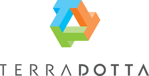
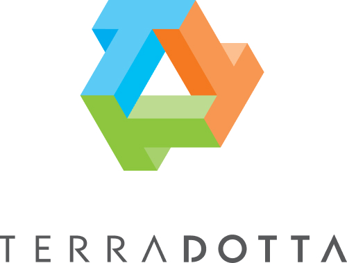
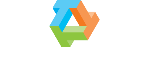
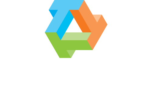
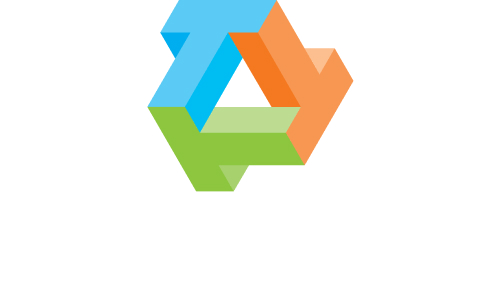
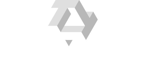
The Terra Dotta logo consists of the three-color “T3” logo mark and the stylized Terra Dotta logotype. The “T3” mark represents connection and movement through its geometric form, while the logotype provides clarity and balance.
Together, these elements create a unified, recognizable mark that ensures consistent brand representation across all applications.
The primary identity layout is horizontal. When space is restricted, the centered, stacked logo signature version may be used.
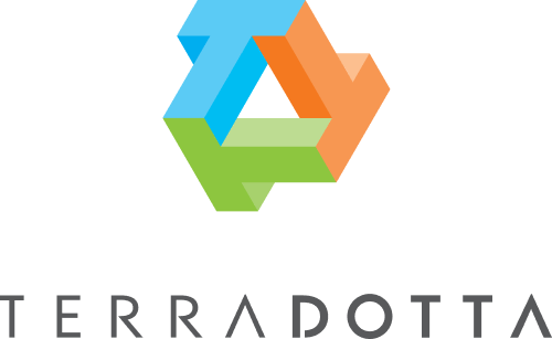
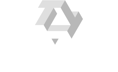
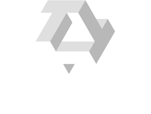


Brand block
(Minimal size)

Set in the typeface Montserrat regular, the corporate tagline may appear below the logo signature. When space is more vertical, and a larger logo mark (relative to the logotype) is desired, one of the large logo versions may be used. Versions B and C are best when the logo will be reproduced at a very small size.
For applications that are powered by Terra Dotta, the Powered by Terra Dotta may be used.


RGB: R:0 G:172 B:236
HSL: H:196 S:100 L:46
HEX: #00ACEC
CMYK: C:100% M:0% Y:0% K:0%
Pantone: Process
RGB: R:159 G:197 B:77
HSL: H:79 S:51 L:54
HEX: #9fc54d
CMYK: C:50% M:0% Y:100% K:0%
Pantone: 368
RGB: R:217 G120 B:45
HSL: H:21 S:100 L:60
HEX: #d9782d
CMYK: C:0% M:65% Y:100% K:0%
Pantone: 158
RGB: R:24 G:76 B:132
HSL: H:211 S:69 L:31
HEX: #184C84
CMYK: C:82% M:43% Y:0% K: 48%
Pantone: 647 C
RGB: R:89 G:89 B:91
HSL: H:220 S:2 L:35
HEX: #59595b
CMYK: C:0% M:0% Y:0% K:80%
Pantone: Cool Gray 11
#00ACEC
#9FC54D
#D9782D
#40C1F1
#B7D37A
#F79A59
#73D1F5
#CADF9D
#F9B585
#00ACEC
#40C1F1
#73D1F5
#9FC54D
#D9782D
#B7D37A
#F79A59
#CADF9D
#F9B585
RGB: R:240 G246 B:255
HSL: H:216 S:100 L:97
HEX: #F0F6FF
CMYK: C:6% M:4% Y:0% K:0%
Pantone: 656 C
RGB: R:250 G:255 B:243
HSL: H:85 S:100 L:98
HEX: #FAFFF3
CMYK: C:2% M:0% Y:5% K:0%
Pantone: 7496 C
RGB: R:255 G241 B_231
HSL: H:21 S:100 L:60
HEX: #FFF1E7
CMYK: C:0% M:5% Y:9% K:0%
Pantone: 7604 C
RGB: R:252 G:243 B:255
HSL: H:285 S:100 L:98
HEX: #FCF3FF
CMYK: C:1% M:5% Y:0% K: 0%
Pantone: 663 C
RGB: R:205 G:53 B:41
HSL: H:4 S:86 L:53
HEX: #EE2E21
CMYK: C:0% M:95% Y:100% K:0%
Pantone: 1795
RGB: R:113 G:65 B:148
HSL: H:283 S:42 L:42
HEX: #7E3E98
CMYK: C:60% M:90% Y:0% K:0%
Pantone: 259
RGB:R:36 G:155 B:149
HSL: H:177 S:99 L:31
HEX: #019C93
CMYK: C:0% M:65% Y:100% K:0%
Pantone: 326
RGB: R:254 G:202 B:12
HSL: H:48 S:99 L:52
HEX: #FECA0C
CMYK: C:0% M:20% Y:95% K: 0%
Pantone: 123 C
RGB: R:252 G:184 B:20
HSL: H:45 S:97 L:53
HEX: #FCB814
CMYK: C:0% M:27% Y:92% K:0%
Pantone: 7408 C
Terra Dotta Blue, Green, Orange, Dark Blue, and Gray are the core brand colors and should be used as the foundation of all brand communications. These colors should dominate layouts, especially in headers, key messages, navigation elements, and primary callouts, as seen across web pages, social tiles, and marketing materials.
Blue and Green should be prioritized for trust, education, and informational content, while Orange is used selectively to highlight actions, emphasis areas, or moments of energy. Dark Blue and Gray serve as neutral anchors for typography, backgrounds, and structural elements.
The secondary color palette is used to support and extend the primary palette. These colors may be applied in promotional materials, social content, illustrations, data visualization, and UI accents to add flexibility and visual interest.
Secondary colors should neveroverpower the primary palette and must always be used in balance, reinforcing—not replacing—the core brand colors.
Layouts should follow a clear color hierarchy:
One primary color should lead each layout.
One secondary color may be used for support or as an accent.
Neutral colors (Dark Blue and Gray) should ground the composition and support readability.
Avoid using too many bold colors in a single layout. Clean spacing and color restraint are essential to maintain clarity and brand recognition.
Always ensure sufficient contrast between text and background colors to maintain readability and accessibility.
Light background colors should be paired with dark text, while bold color blocks should use white or high-contrast typography.
Avoid placing text over busy imagery or low-contrast color combinations.
Avoid using orange with black; if a dark color is needed, use Dark Blue or Gray.
In social media and digital marketing assets, bold color blocks may be used to frame photography, highlight headlines, or create modular layouts. Colors should be applied consistently across campaigns to reinforce brand recognition while allowing flexibility in content themes. Bold color blocks may be used to frame photography, highlight headlines, or create modular layouts in social media and campaign assets. Seasonal or event-based designs may lean more heavily on secondary colors, as long as the overall look remains cohesive and recognizable as Terra Dotta. Color usage should feel intentional, not decorative.
Do not alter brand colors, create unapproved shades, or mix colors in a way that compromises legibility or brand consistency. Avoid gradients, overlays, or effects that are not part of the approved color system. Do not sacrifice contrast or legibility for aesthetic purposes.
Montserrat is the primary typeface used across all Terra Dotta communications. Its modern, geometric design reflects clarity, approachability, and professionalism, making it suitable for both digital and print applications.
The typeface should be used consistently to establish a clear visual hierarchy through weight, size, and spacing. Headlines should feel confident and structured, while body copy remains highly legible at smaller sizes. Proper use of Montserrat helps create a cohesive, recognizable brand voice and ensures readability across platforms, devices, and content types.

Serif typefaces may be used selectively to complement Montserrat in specific contexts where added warmth, personality, or visual interest is desired. This includes social media campaigns, seasonal or cultural posts, and special materials such as holiday cards or celebratory announcements.
Serif typography should be used intentionally and sparingly, always supporting the primary brand system rather than replacing it. It works best for short headlines, highlights, or accent text, while Montserrat remains the primary typeface for structure, clarity, and legibility. When used correctly, serif type enhances expression and emotion without compromising consistency or readability.

Headlines are used to communicate the primary message quickly and clearly. They should be bold, confident, and immediately legible on mobile screens.
Montserrat Bold or SemiBold should be used for headlines. Headline text should remain short and direct, typically limited to one or two lines. In some case for social media que can use Black. Headlines should never feel compressed or crowded and must always maintain strong contrast against the background.
Avoid decorative treatments. Clean typography is essential to preserve clarity and brand recognition. Symbols (tildes, arrows, etc.): Generally, these should be avoided within headlines or main graphic layouts, as they can clutter the clean, structured design established for the brand. Emoji usage: Discouraged in primary graphic headlines to maintain a professional tone, but are appropriate for social media captions to reflect the “human and approachable” side of the brand.
Body text supports the headline by providing context or additional information. It should remain simple, readable, and unobtrusive.
Montserrat Regular or Medium should be used for body copy. Body text should be kept concise and should never compete visually with the headline. Proper line spacing and comfortable margins are required to maintain readability, especially on small screens.
Each post should communicate one clear idea at a glance.
Text should never overpower photography or illustrations. It should frame the message, not dominate the layout.
Accessibility is a core requirement across all typography usage.
When in doubt, prioritize clarity over style. Readability and inclusivity are essential to maintaining a strong and accessible brand presence.